Quit Big Tobacco
A campaign by Vital Strategies to cut the ties between Big Tobacco and marketing
Vital Strategies Says
Christina Curell, Communication Associate
Julia is friendly and professional, she communicates well, she paid attention to our problems to see the big picture; she was well-organized and managed the overall project and timeline well. She also seemed to understand and care about the campaign issue and have experience working on other public health projects. We have a beautiful, functional site!
Project Goals
Website Redesign
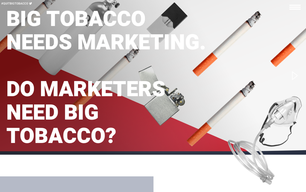
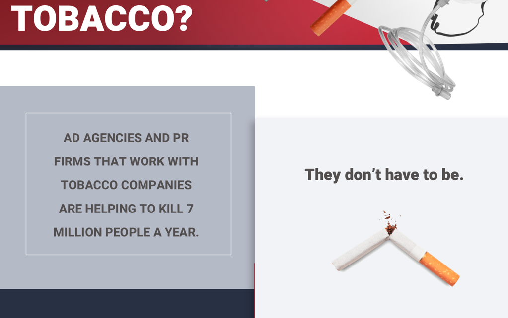
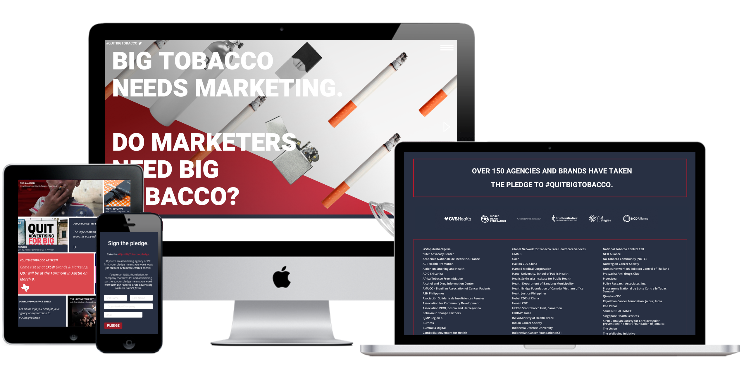
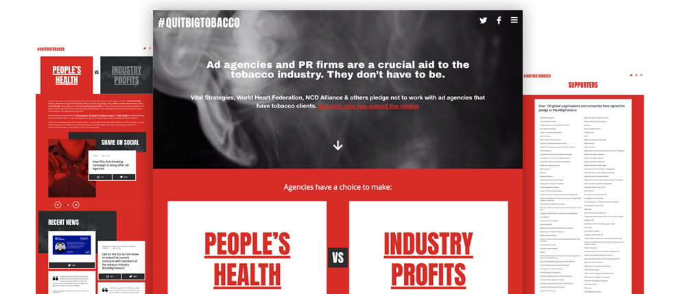
The Quit Big Tobacco team felt that their existing site was too content- and text-heavy, making it hard to navigate. They wanted a sleeker, more professional look — a design sharp enough to stand up to the new target audience of ad & PR people, but not so glossy that do-gooders would be turned off or confused. They were hoping the color palette could be kept similar, but somehow massaged to feel less accusatory, and more alluring. They needed help organizing a large amount of content, and making the site more interactive and modern.
Specific Requests
Concepts
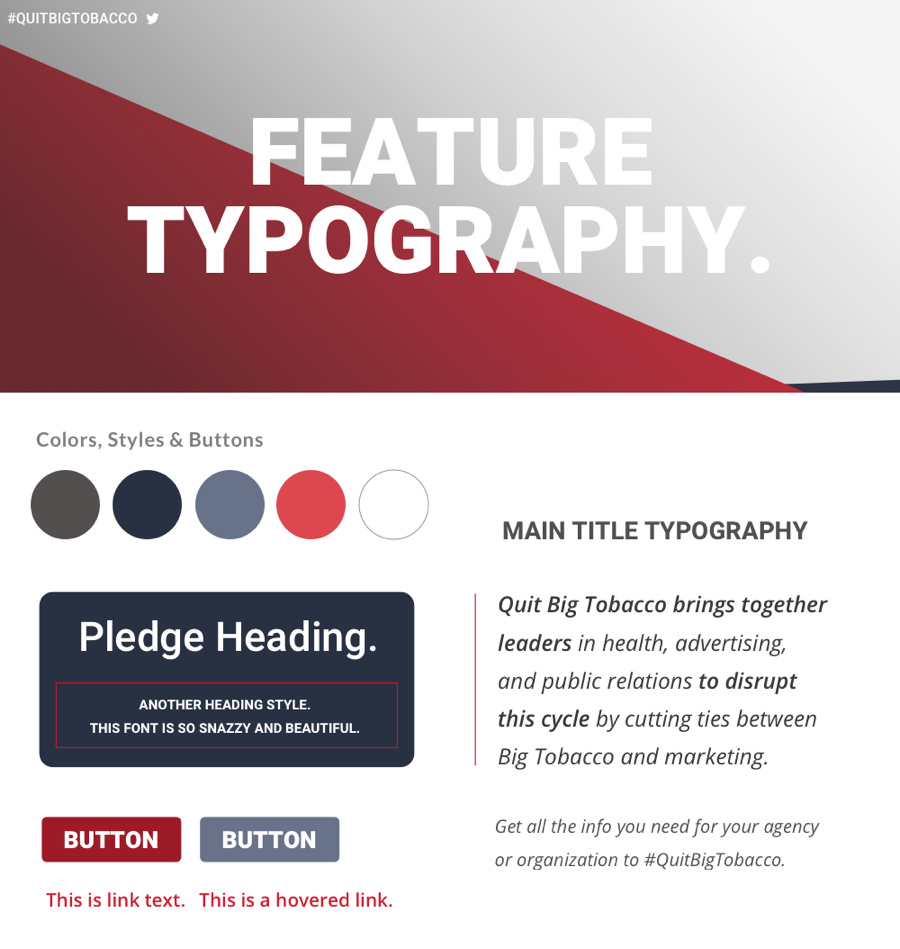
Feel: Contemporary, eye-catching, engaging.
Details: Red, black/gray, and white palette as well as layering texture to be kept from old site, but updated in parallel with a sleek ad look that simultaneously maintained a human element. Custom templates with custom input fields on multiple pages. Clean solutions for housing large amounts of text-based information. Site to be designed around pre-existing logo and artwork. Elegant integration of video, article links, and downloadable materials. Simple, clean, styled Twitter feed embed. Sticky footer menu. One-page feel with navigational pages for further depth. Back-end interface to be created for staff to update independently.
The End
Results
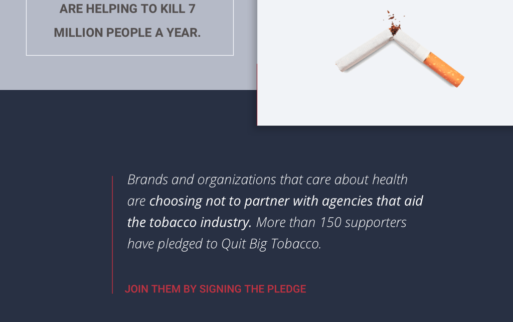
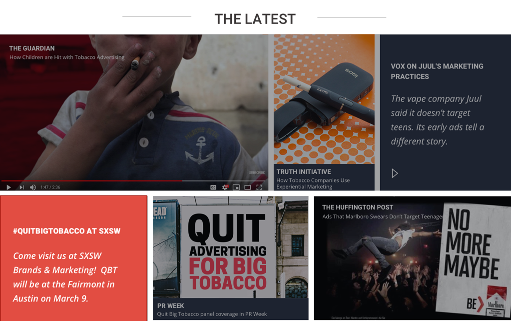
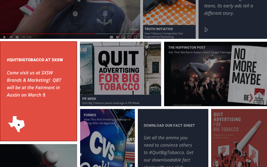
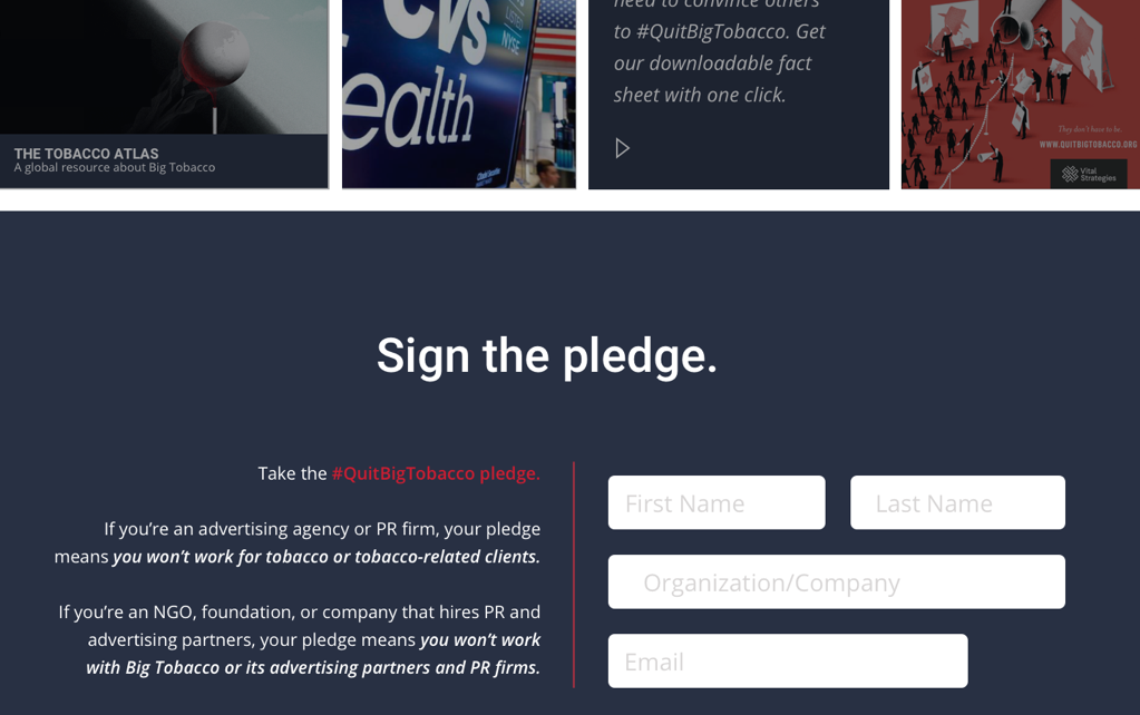
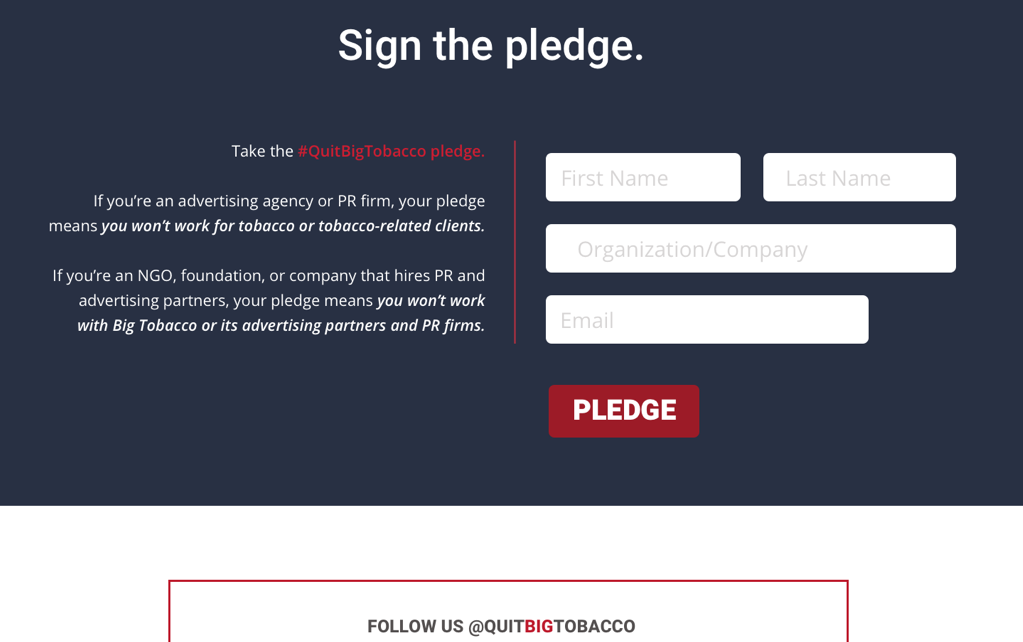
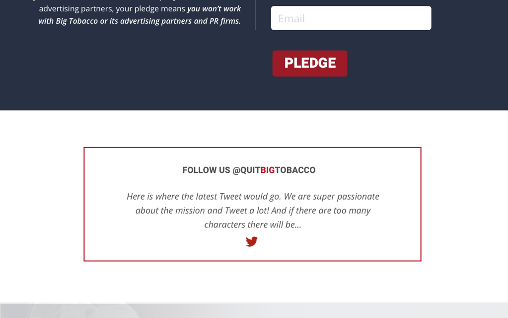
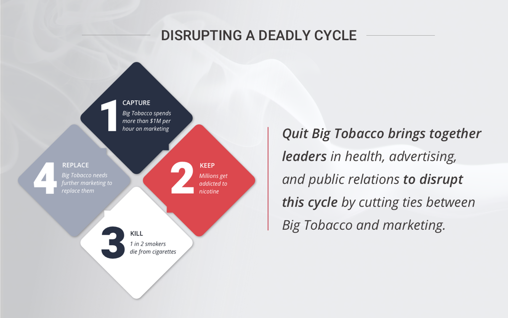
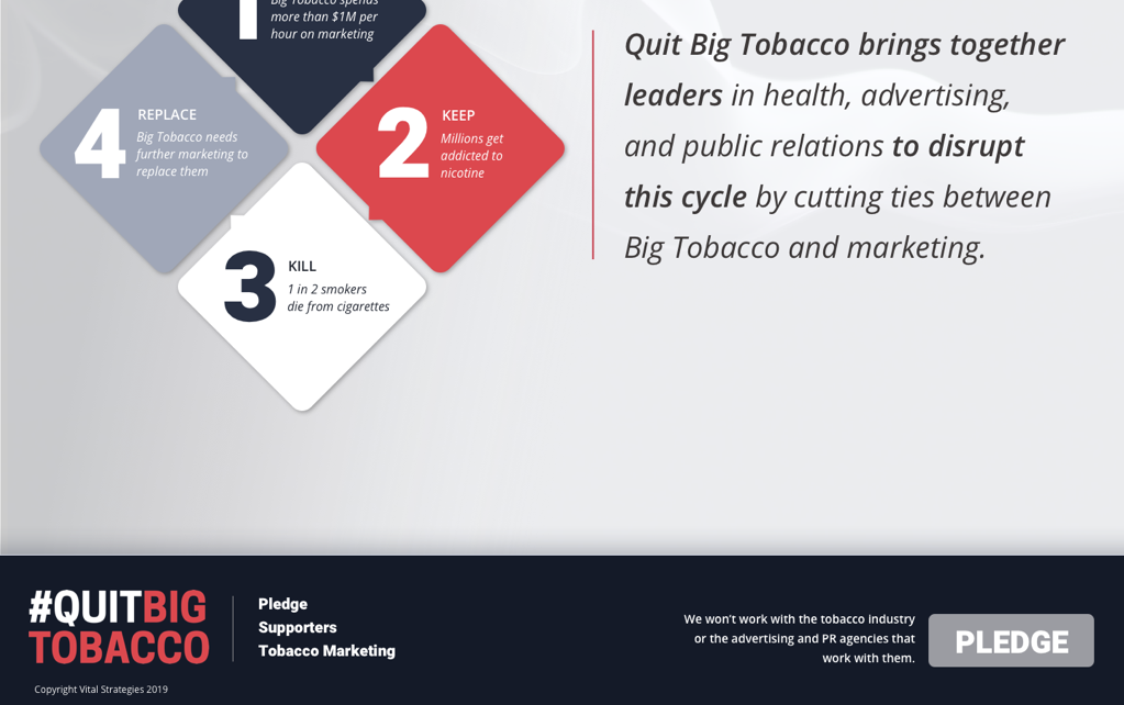
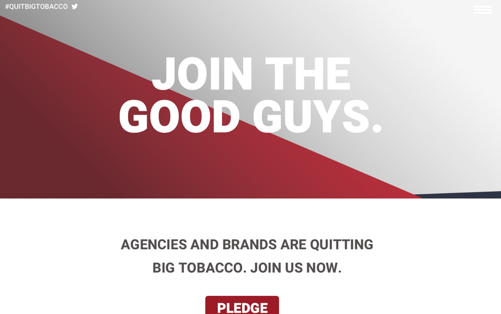
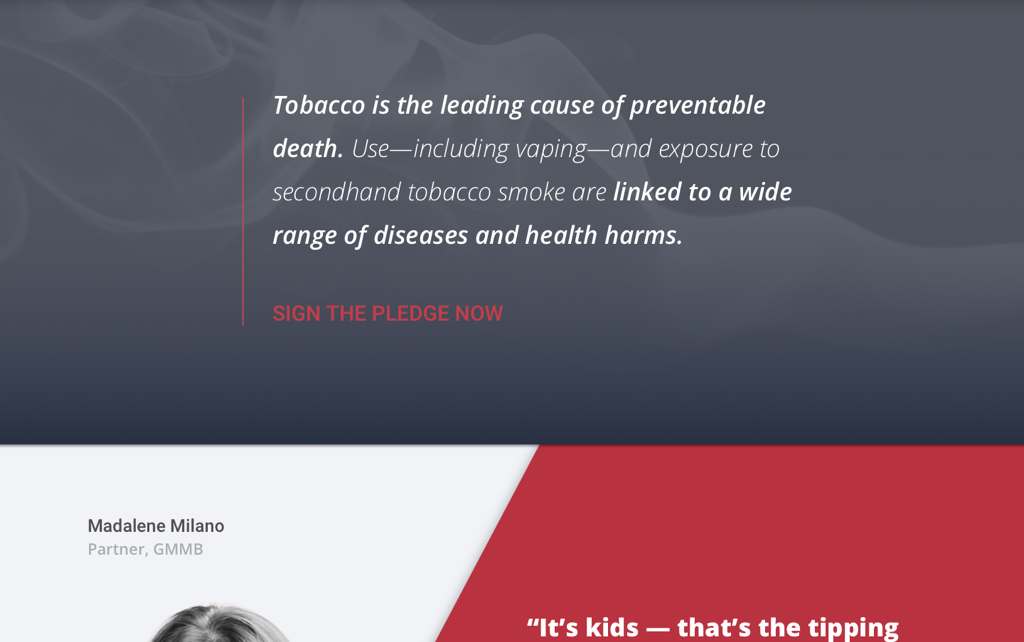
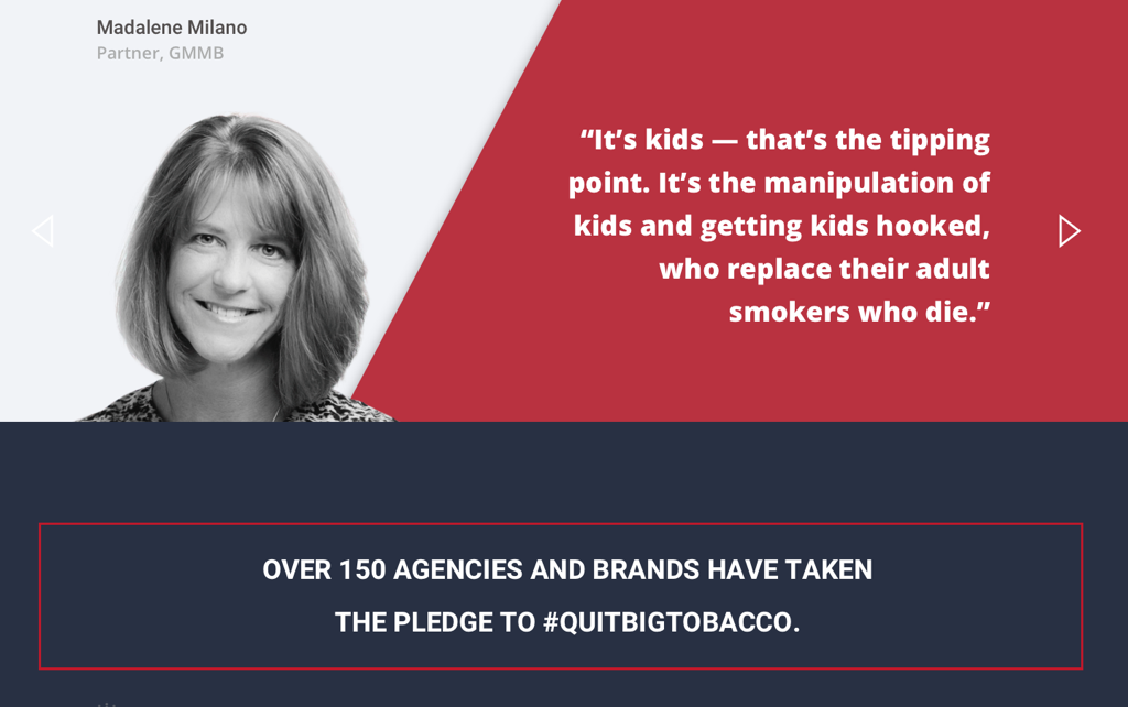
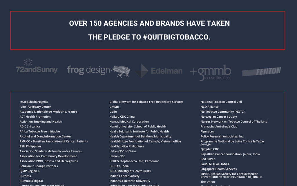
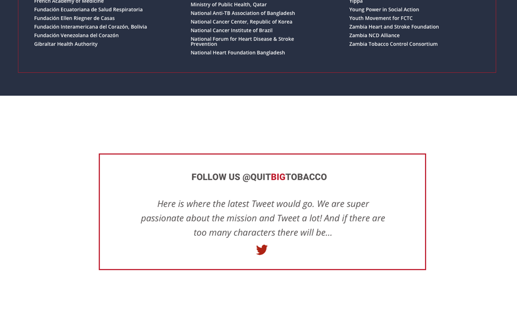
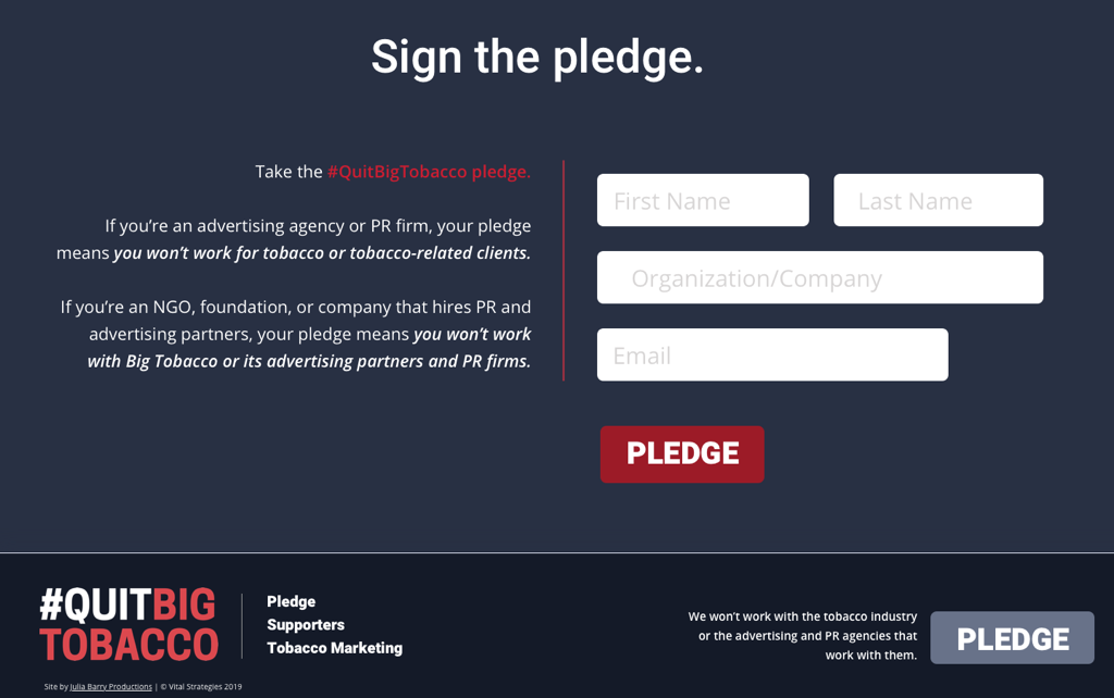
News items were combined into a masonry grid area called “The Latest,” which not only gives a contemporary “ad” feel, but also provides a polished way to handle multiple types of media. Staff are able to manually control downloadable materials and link out to the latest industry breakthroughs, side by side with an auto-feed of the campaign’s latest Tweets — no fuss, no muss. The ability to humanize the campaign above the fold with testimonials was very important to the QBT team, but so was keeping the site design clean and immediately engaging; a slider was therefore utilized as a way to contain more content without taking up valuable “real estate” above the fold. The campaign’s color palette was kept for continuity and recognition, but hues were improved to provide richer, more beautiful color as well to increase readability, projecting a much higher level of professionalism and modern relevance. An outdated background video of smoke was removed, and instead subtle smoke and reimagined tobacco industry imagery was used around the site to greater effect. Important statistics and Calls to Action were identified during consulting meetings, and therefore could be highlighted around the site, leaving deep-dive reading for the downloads and eliminating the feeling of overwhelm which the QBT team felt was driving visitors away from their old site. Most importantly, visitors were encouraged to sign the #quitbigtobacco pledge no matter where they were on the site, via a sticky footer menu and repeating “Sign the Pledge” modules on all pages.