New Rochelle Fund
for Educational Excellence
Advancing equity, excellence, and inspiration in public school
NRED Says
Andrea Berman, Executive Director
Our new website is much more user-friendly and easily updated internally. Julia was accessible throughout the process – a breath of fresh air! She walked us through the options for redeveloping the site and was cognizant and respectful of our nonprofit budget. Our Board members and donors are pleased…And, thanks to our new site, hopefully more donors will be coming soon!
Project Goals
Website Redesign
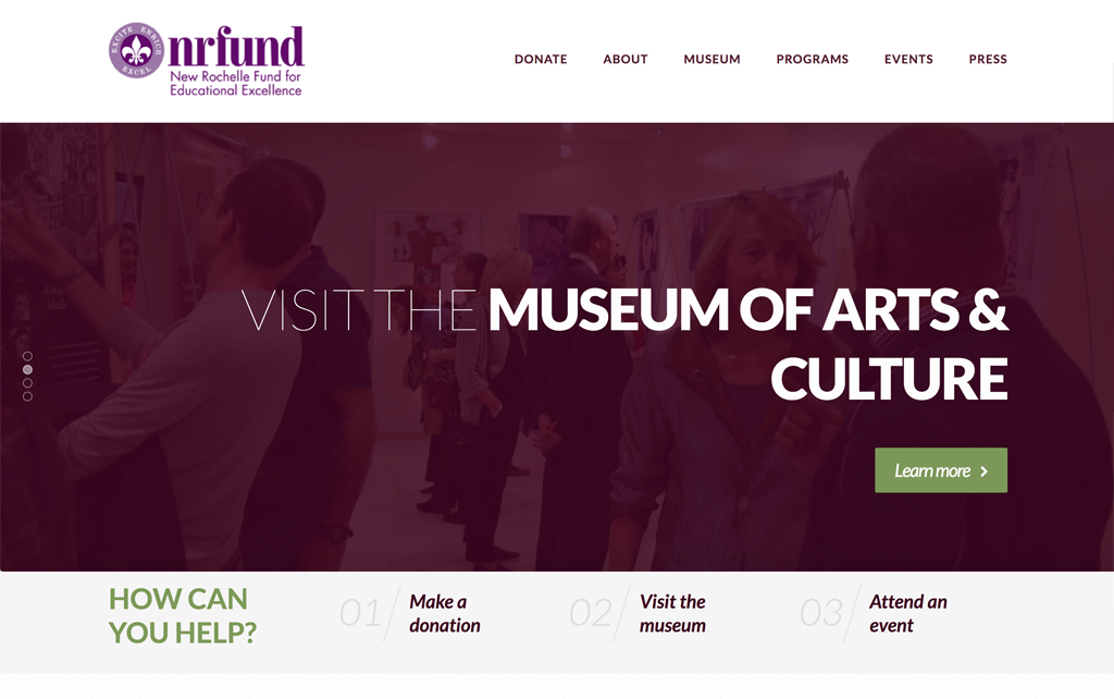
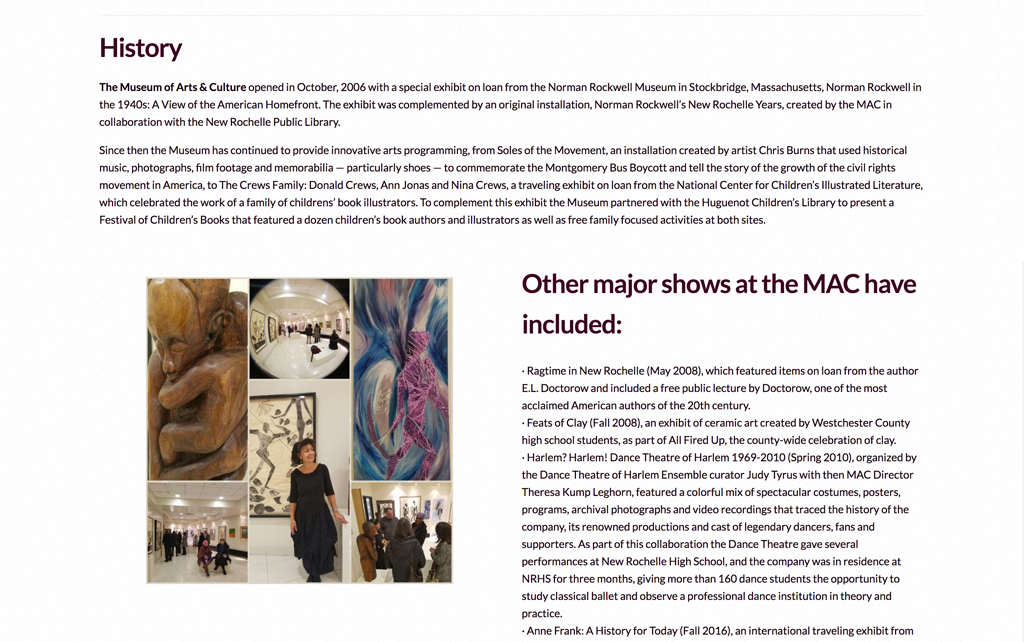
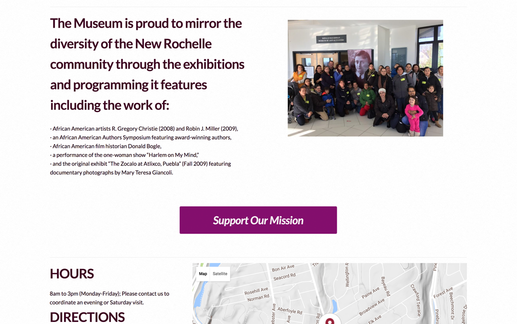
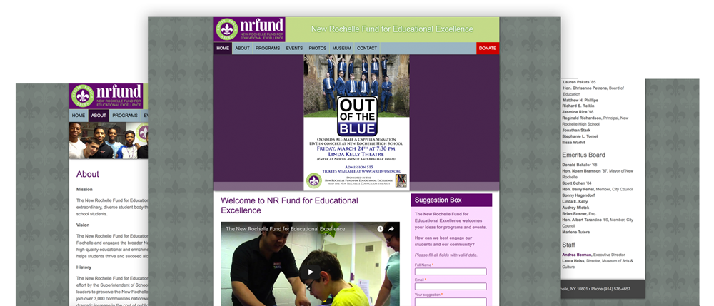
The objectives for NRED’s new site were to create a more engaging and clear site with highlighted news, a cleaner navigation experience, and an easier back-end experience for staff updating. By streamlining site organization, simplifying the menu, and archiving outdated content, their website would have a contemporary, powerhouse look in line with other non-profit organizations.
Specific Requests
Concepts
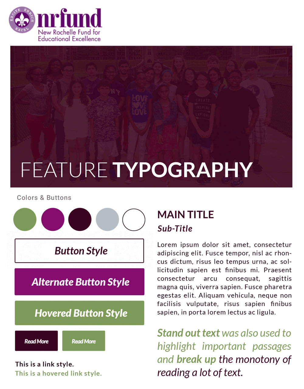
Feel: Active and professional.
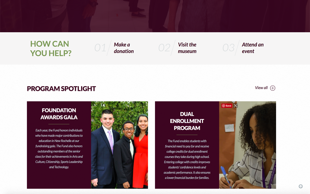
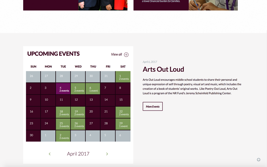
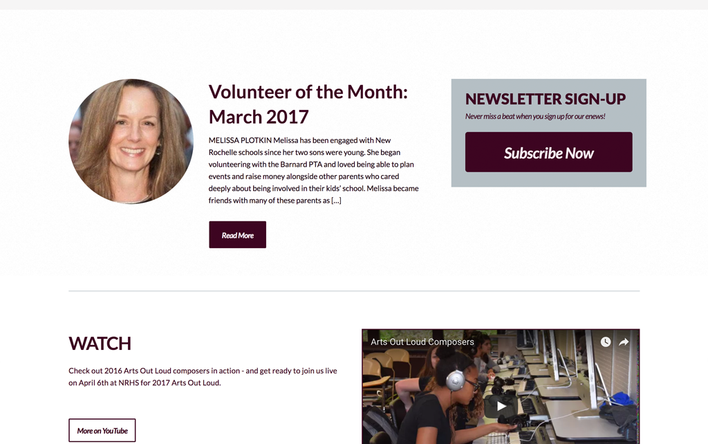
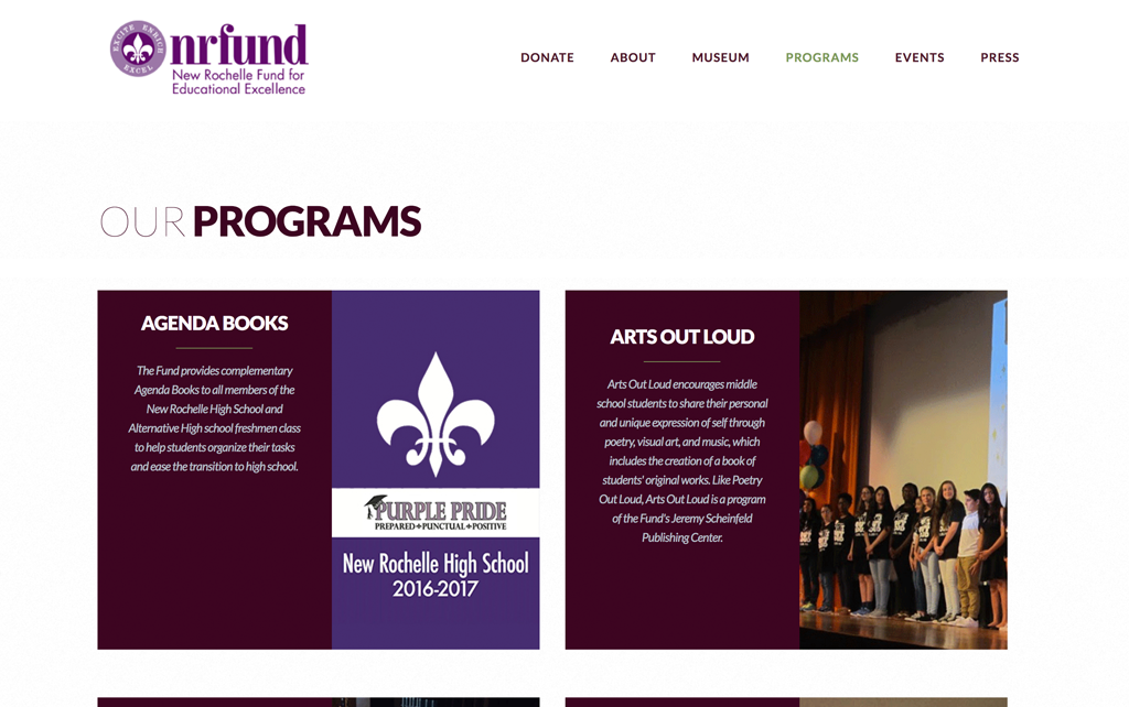
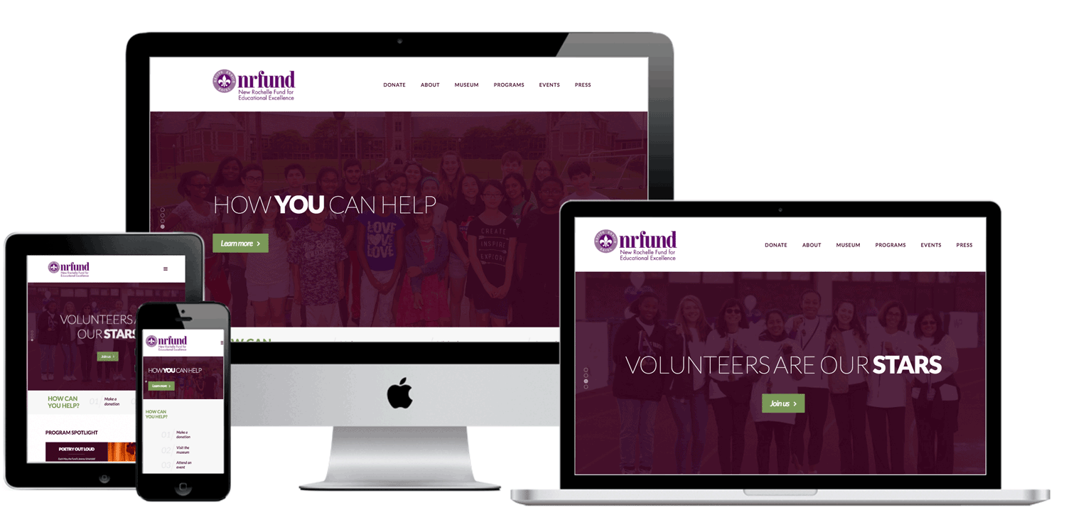
Details: Use purple and green and design around pre-existing logo. Organize and pare down a lot of text copy and images into an intuitive and understandable visitor experience. Include social media buttons, and board member/staff bios. Extended functions include calendar, video, volunteer blog section, donation acceptance, and user-friendly interface for future client updating.
The End
Results
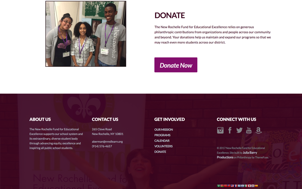
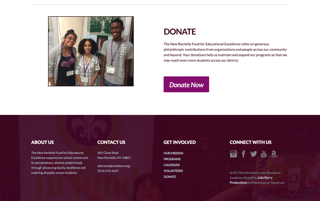
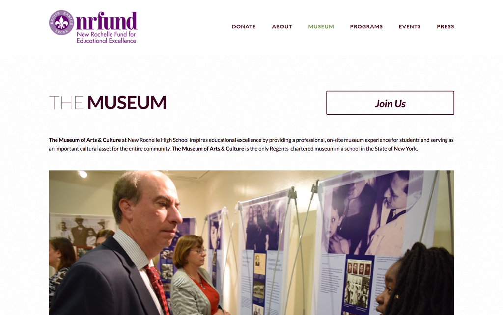
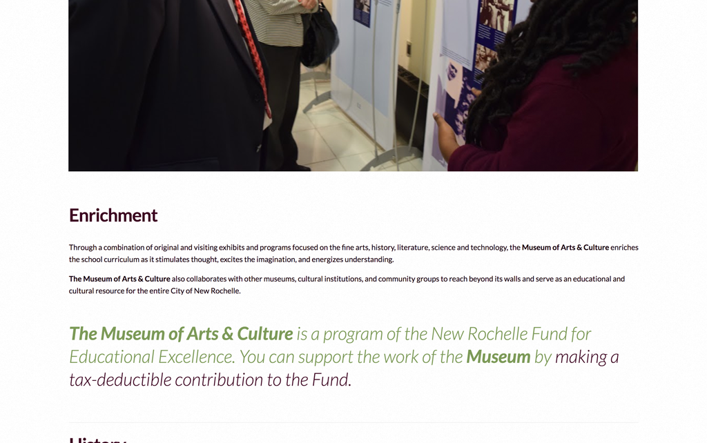
We brought the look of the site from a DIY 1990’s aesthetic to that of a trusted organization with an enriching, important mission. We eliminated block color banners and sidebars which looked dated and wasted space, and instead made use of alternating imagery and text with white space for a more modern, accessible look. Using the full width of the site reduced scrolling and allowed for stronger, larger text and images, while replacing a heavy patterned background with white created comfort and readability. We pared down the number of colors and fonts being used on the site to create visual unity, and specified use of classic, royal colors and fonts that project innovation and integrity. We decreased and renamed the menu items to reduce clutter, make topics clearer, and show important content above the fold. A sticky navigation menu and an “up to top” button helped users never lose their place. Graphic elements and photos guided users to find what they were looking for, and enticed them to learn new information, get involved with events, and donate to the cause. And of course, we made the site responsive, so anyone anywhere can get involved with NRED’s great work.
