Fay Shutzer
Painter
Fay says
Julia is a complete pleasure to work with. She is extremely knowledgable and able to understand the client’s needs and wishes, while designing a site that fits perfectly! On top of all of that, she is patient and willing to help, no matter what your level of expertise.
Project Goals
Website Design
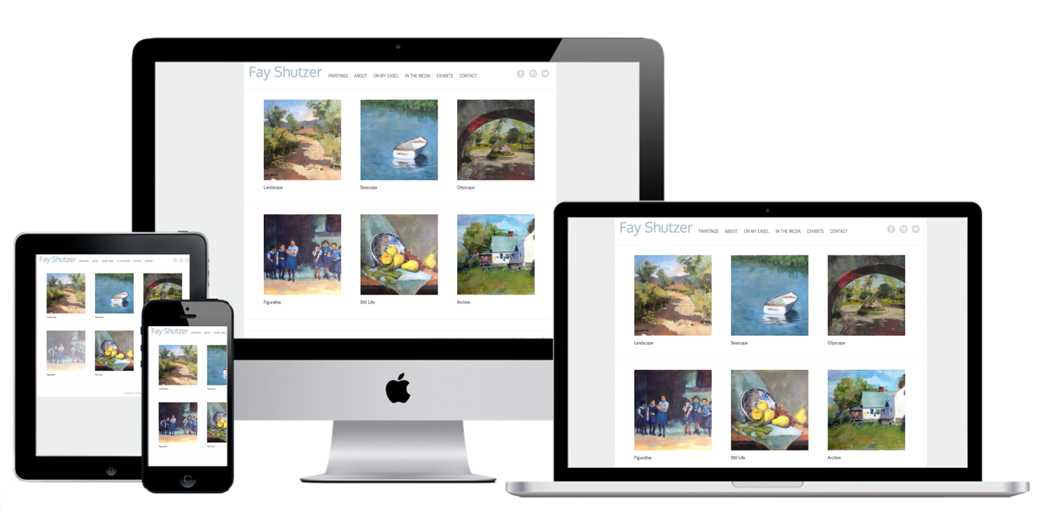
The objectives for Fay’s website were to showcase her artwork and provide information about her background and activities as a painter. Fay wanted a website with an organized, cross-referenceable portfolio, space to present her resume, and an interface that was easy for her to update behind the scenes with her newest Instagram posts, class schedules, and gallery shows details.

Specific Requests
Concepts
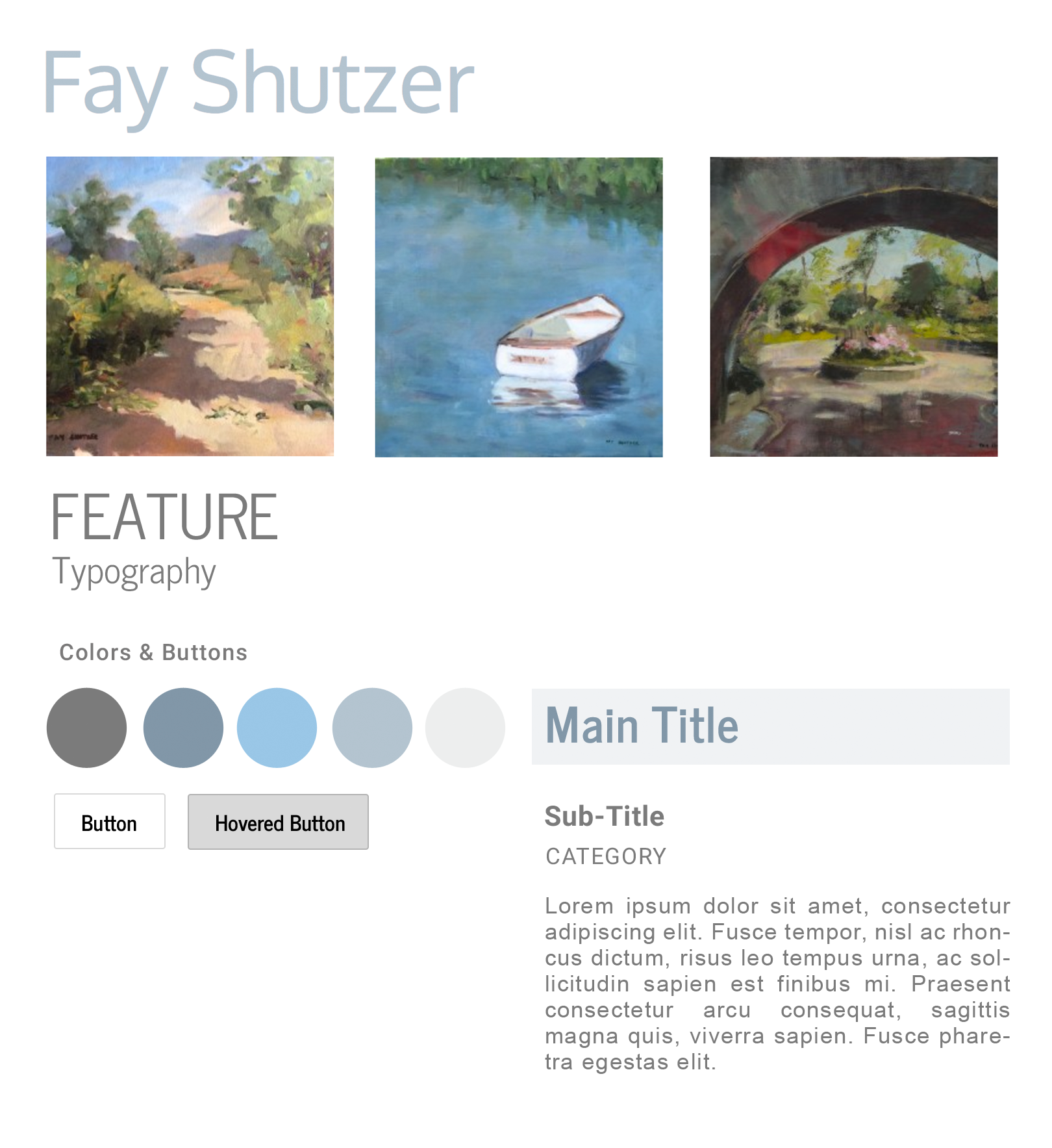
Feel: Professional but unpretentious, with a clean but warm feel that lets the artwork speak for itself.
Details: Neutral, beachy color scheme provides light and air, and directs visitor attention to the paintings. Client-editable gallery; Instagram integration.
The End
Results
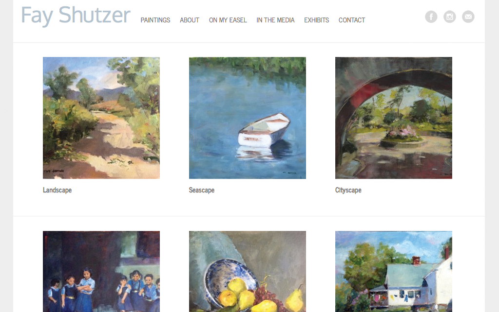
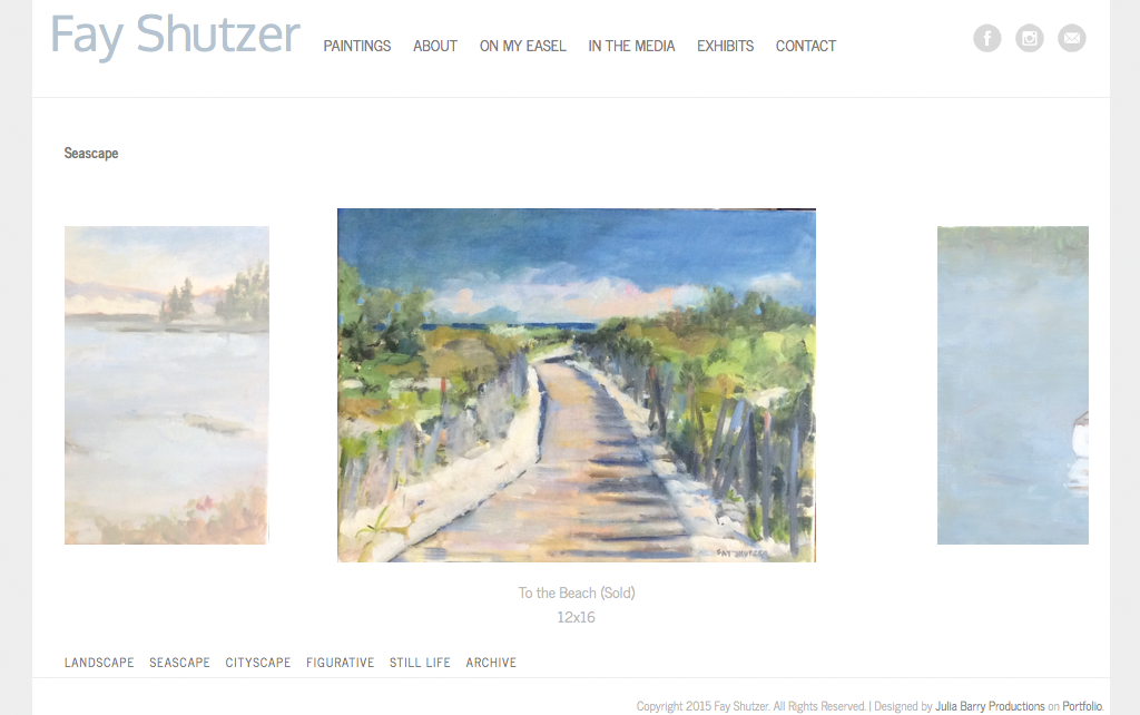
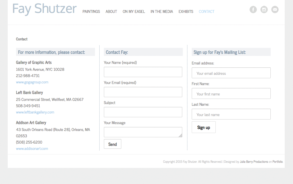
There’s nothing like starting from a clean slate! We created a completely new, custom site based on Fay’s color aesthetic, personality, and business goals. Everything about this site is clean and breezy from the pastel, water-inspired color palette to the white background to the calm font of the textual logo. Social buttons were integrated into the top menu so contact is intuitive and easy. Fay wasn’t a fan of very large images and wanted to highlight her art more than herself, so we presented the different types of paintings she makes in a symmetrical, clear grid that draws you in — but gently. Likewise, all her paintings are shown in an inviting size wherever you are on the site. And once inside the site, a secondary menu was used near the footer to duplicate the categories presented on the front page, so you’re always just one click away from any desired content. The site is purposely minimal and elegant with a timeless flair — just like Fay and her work.
