Jean Kilbourne
Pioneering Activist, Speaker & Writer
Jean says
I have worked with Julia for 7 years! She has done research, helped with social media, managed my website, and most recently, she did an outstanding job of completely redesigning my website. She is very smart, creative, and a pleasure to work with.
Project Goals
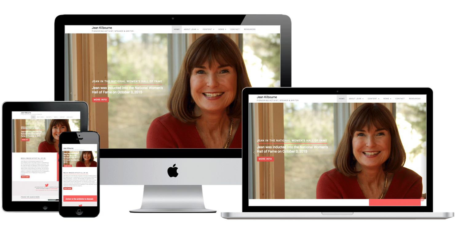
Website Redesign
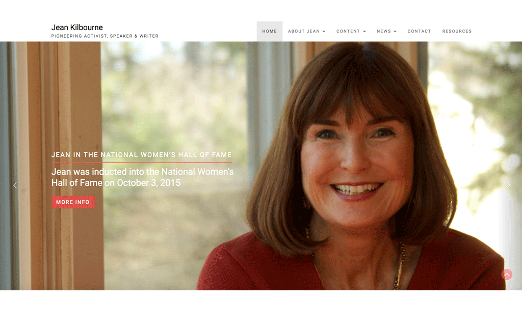
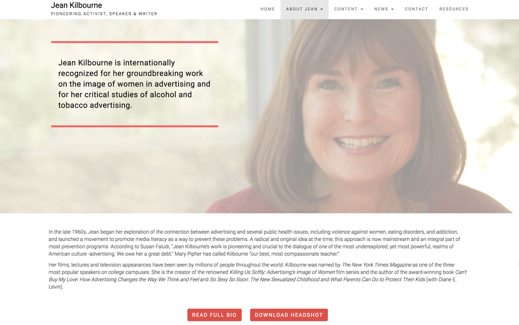
The objectives for Jean’s new site were to better highlight her as an expert, and to improve user experience by creating intuitive navigation, removing distracting elements, finding innovative solutions to handle text-heavy content, and guiding easy access to information sought.
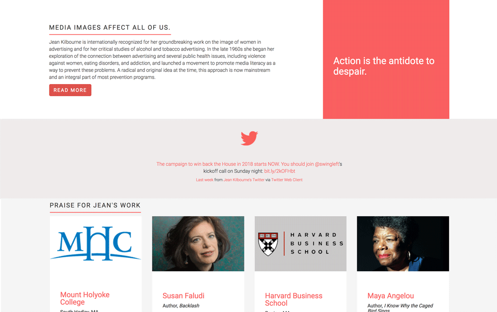
A more elegant integration of her live Twitter feed would serve to better engage users.
Specific Requests
Concepts
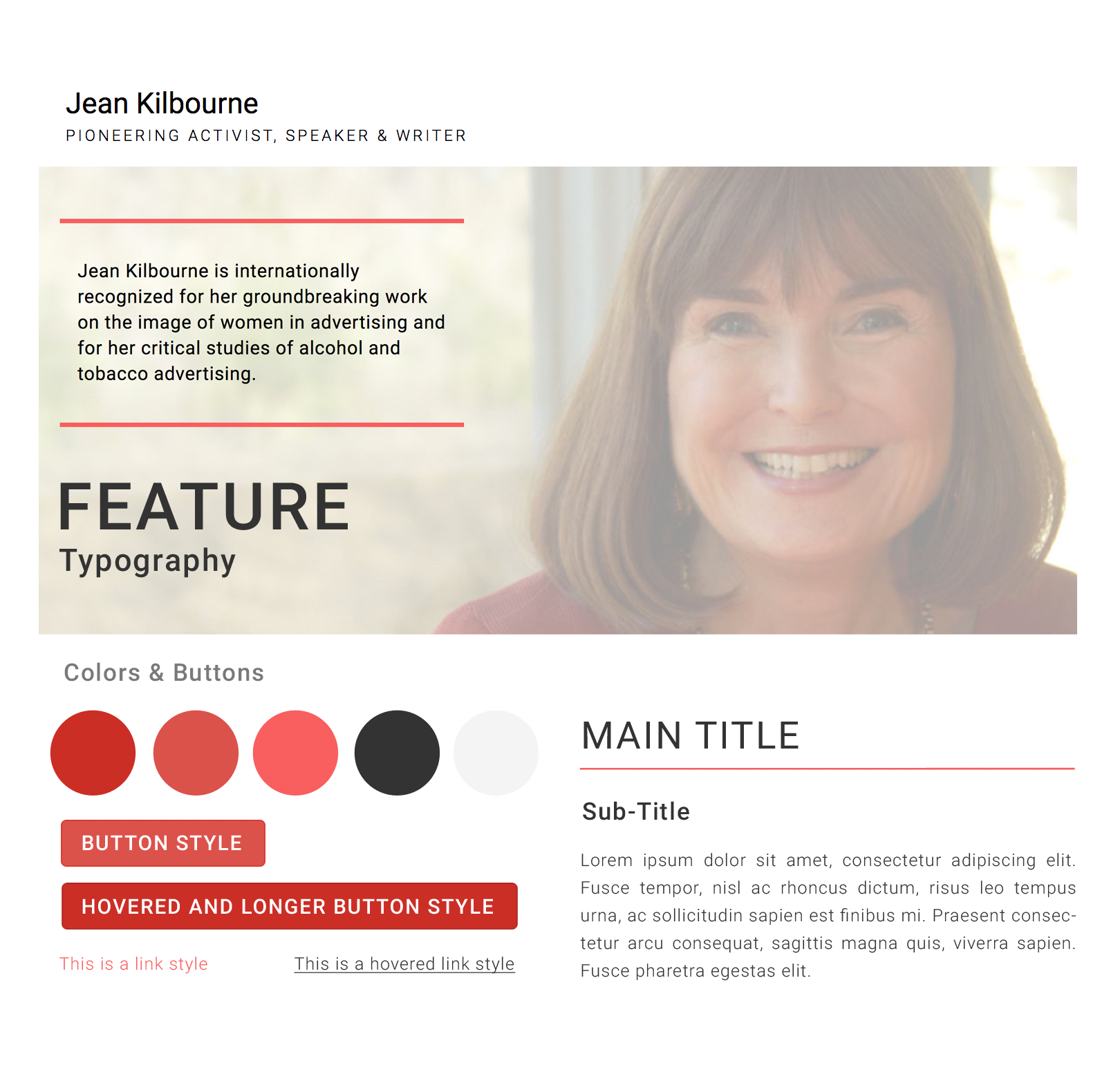
Feel: Clean, modern, spacious, professional, engaging.
Details: Based on white; accent colors in the reds/dark reds. Custom templates, pages, and input fields. Clean solutions for housing large amounts of text-based information. Elegant social media integration. Multiple contact forms. Sticky menu. One-page feel with navigational pages for further depth.
The End
Results
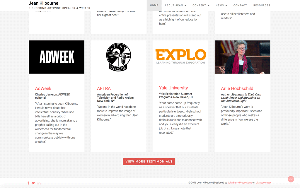
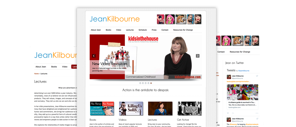
We eliminated sidebars to do away with awkward design that wastes space, instead replacing them with full use of both horizontal and vertical space to better engage the eye and brain. We used the full width of the page for a more spacious design that capitalizes on website “real estate” and reduces scrolling, and replaced a distracting patterned background with white — this is much easier on the eyes, especially for users with glasses. Adding to the clean, spacious look, we eliminated cluttering elements such a calendar and extra graphics that didn’t provide information or function. Instead, we replaced that content with unified design elements and a real color scheme to give the site a professional, purposeful, and cohesive feel. In concert, we used contemporary web fonts to give an accessible, high-class look and facilitate faster load times/font consistency on any device. We combined logo, menu, and page breadcrumbs into a thinner top section to make sure all pertinent content can show above the fold, and added a sticky navigation menu and an “up to top” button so pages with a lot of content are easy to navigate. Also addressing the “tons of text” issue, we added graphic elements and made use of photos (such as around the featured testimonials and in the slider), and organized text content visually with special headlines and standout text, making it easier for viewers to find what they want, absorb what they see, and enjoy the experience. And of course, we made the site responsive, so anyone anywhere can get involved with Jean’s great work.